The Challenge
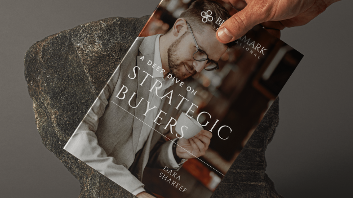
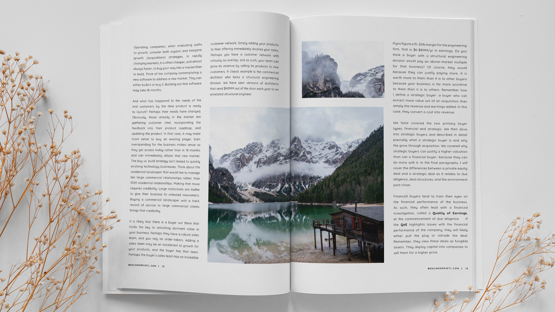
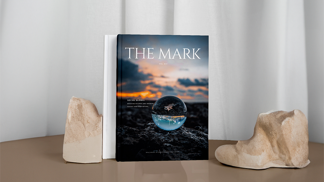
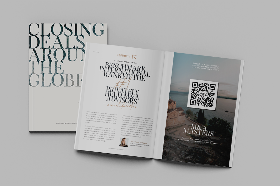
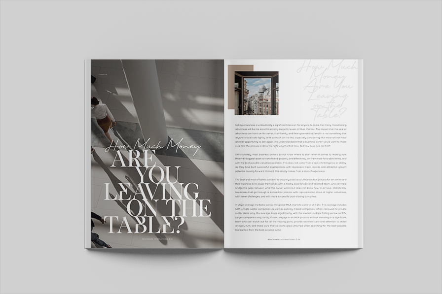
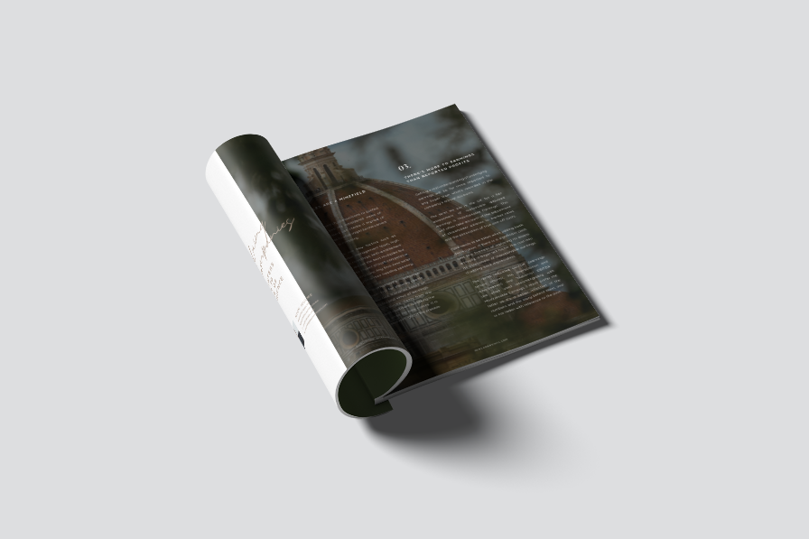
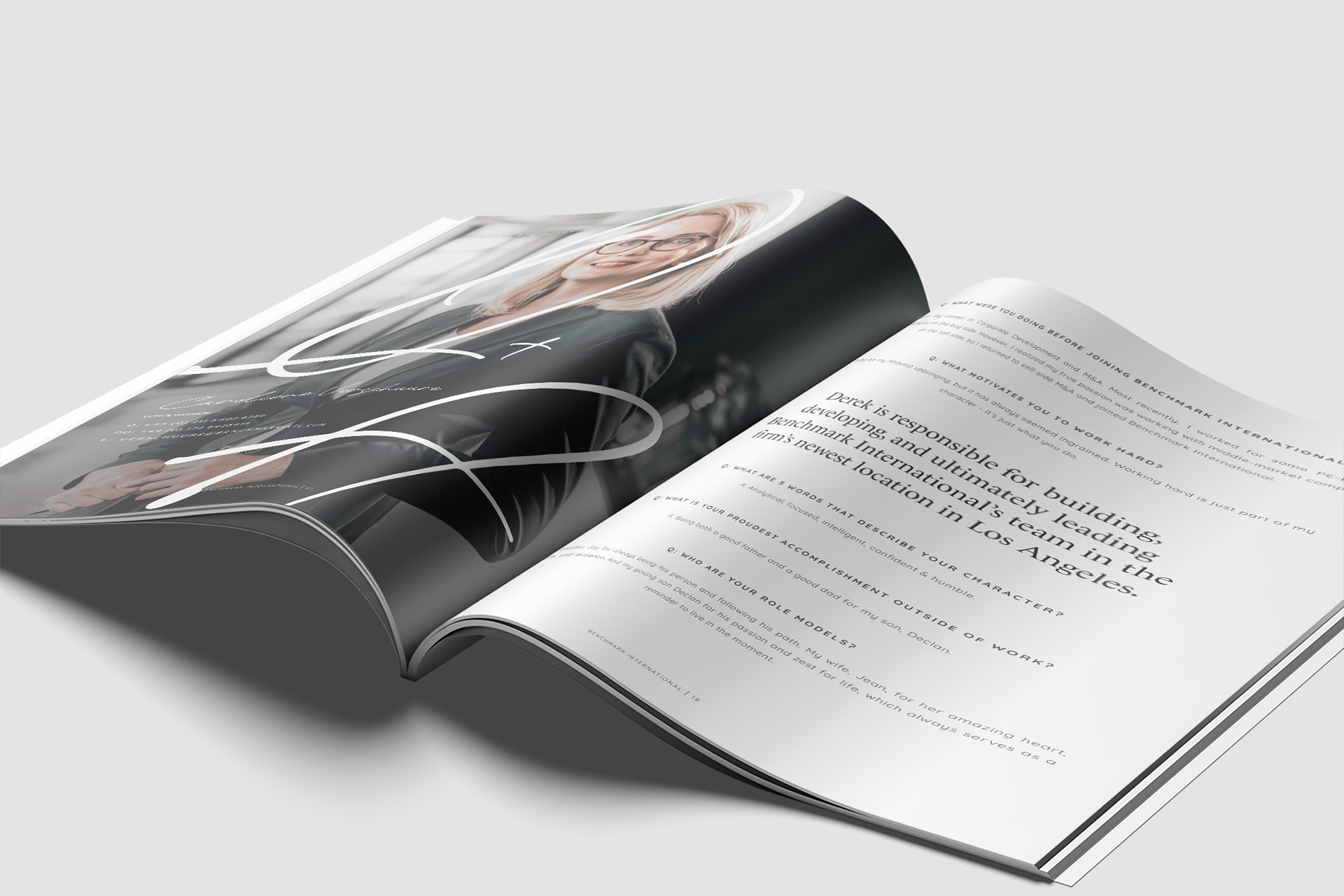
The challenge of elevating the redesign of our bi-annual publication, The Mark, to a new level of wow factor presented an exciting opportunity to push creative boundaries. While the initial rebrand proved successful, there was room for a more visionary approach, particularly in terms of layouts and font choices. Tasked with spearheading this project, I assumed complete responsibility, from content gathering and schedule creation to delegating tasks to junior team members and overseeing the entire production process. My goal was not just to meet expectations but to surpass them, infusing the new volume with innovative layouts and fonts that would captivate our audience. As the project's architect, I aimed to strike a balance between continuity and evolution, maintaining the essence of The Mark while injecting it with a fresh and visionary aesthetic.
The Solution
Commencing the ambitious task of enhancing The Mark's redesign, I initiated the process by meticulously gathering content from various sources, ensuring a diverse and compelling range of articles. Creating a detailed schedule was paramount to navigate the tight timeframe, and I employed a spreadsheet to meticulously organize tasks, deadlines, and team responsibilities. Collaborating with my team, we cross-checked collected articles, ensuring they were free from spelling and grammatical errors, fostering a publication of the highest quality. The project's timeline was unexpectedly condensed to a mere three weeks, prompting an "all hands on deck" urgency that demanded seamless coordination and heightened efficiency.
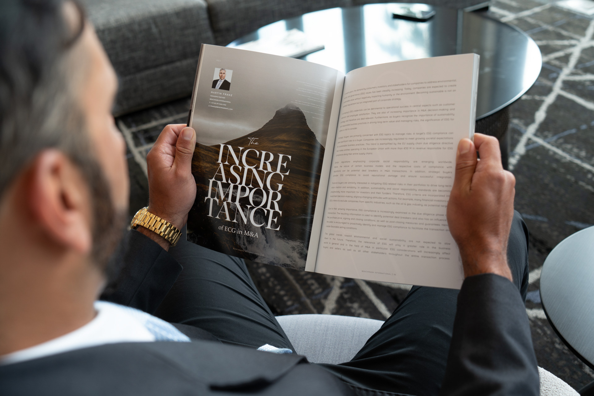
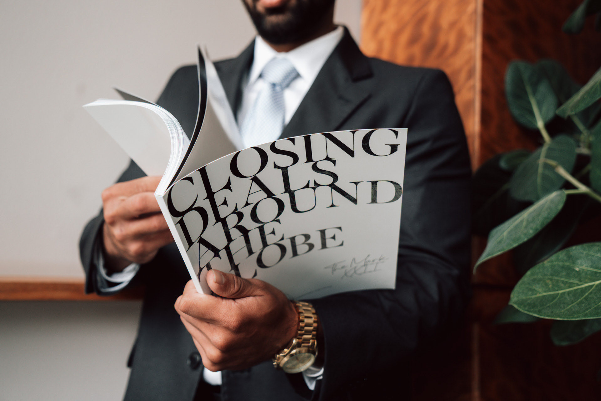
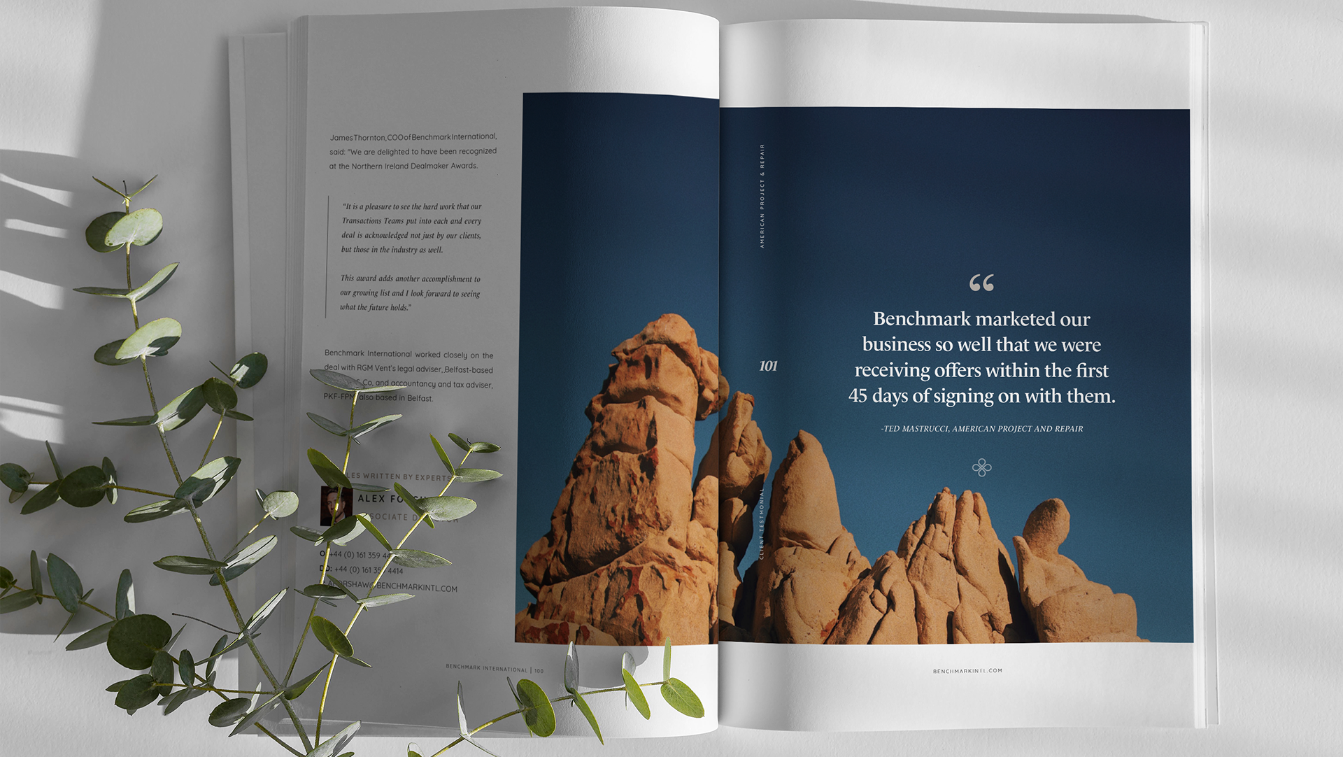
Amidst the time constraints, I seized the opportunity to infuse fresh energy into the magazine's visual identity. Introducing new fonts became a central element, rejuvenating the overall look while seamlessly blending with the established design language. Notably, the decision to make the cover predominantly white was strategic; it not only stood out against the black table covers used at trade shows but also initiated a design motif carried throughout the magazine. This deliberate use of white space created a modern and luxurious feel, enhancing the overall aesthetic.
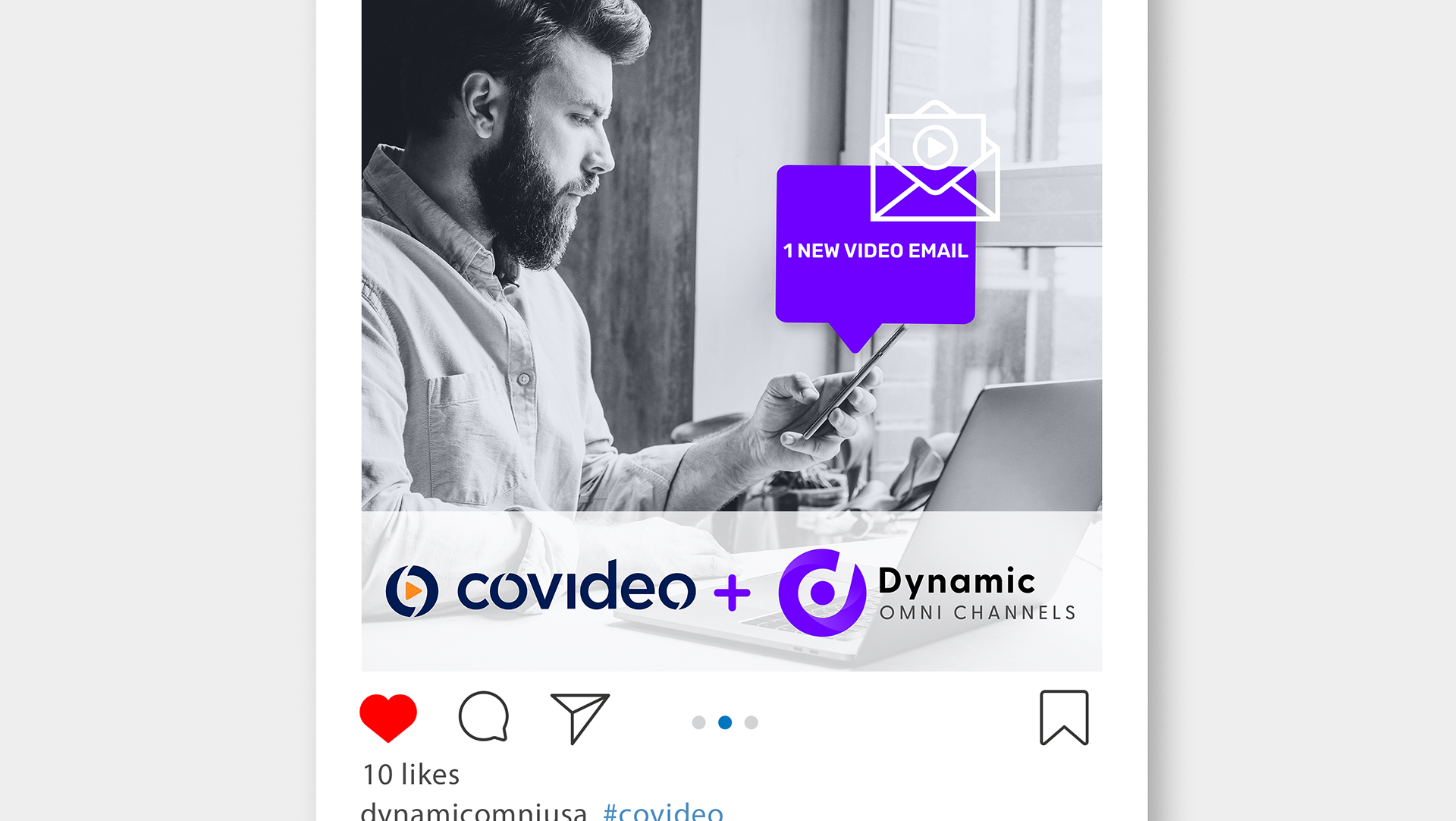
Beyond production, I took charge of developing a post-release social media campaign to ensure the publication's impact extended well beyond its pages, fostering a dynamic engagement with our audience and solidifying The Mark's status as a cutting-edge publication.
The culmination of these efforts resulted in a 94-page magazine that not only met the short deadline but exceeded expectations. Heavily promoted by our sales team, The Mark became a showcase of visionary design and captivating content, leaving a lasting impression on our audience and reinforcing its status as a key publication within our industry.
Categories
Research & Development
Marketing
Social Media
Print Design
Project Management
Web Design
Programs
Indesign
Photoshop
Premiere Pro
After Effects
Hubspot
Flipbook | Flipsnack
Landing Page | Hubspot
Video Advertising | Premiere Pro | After Effects
Real Product Photography | Photoshop | Lightroom

